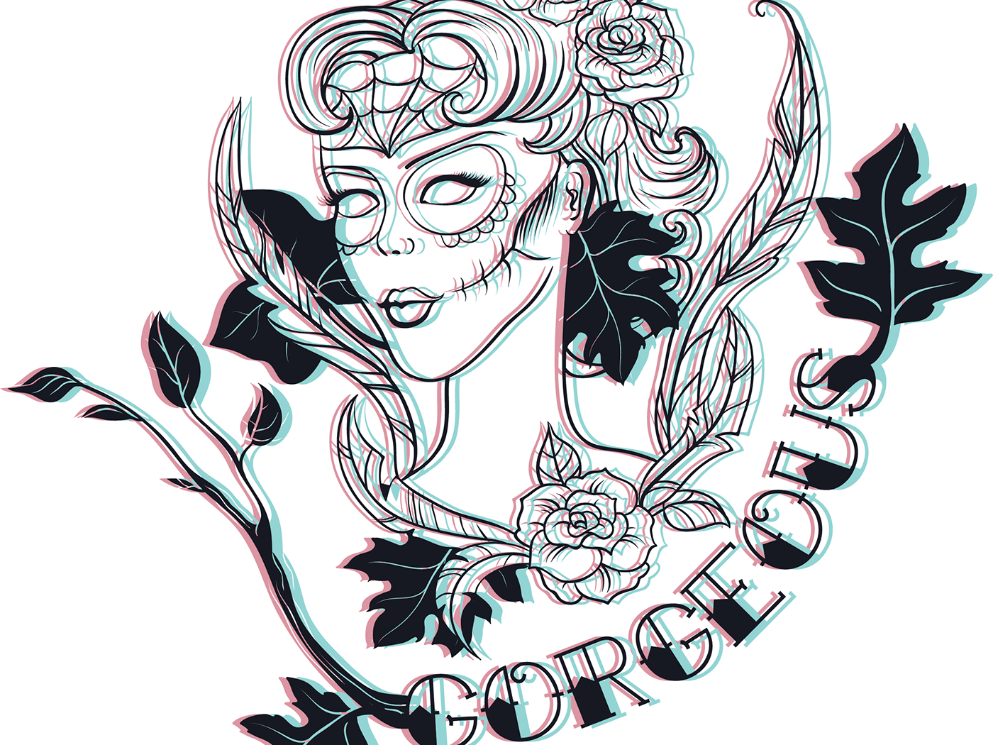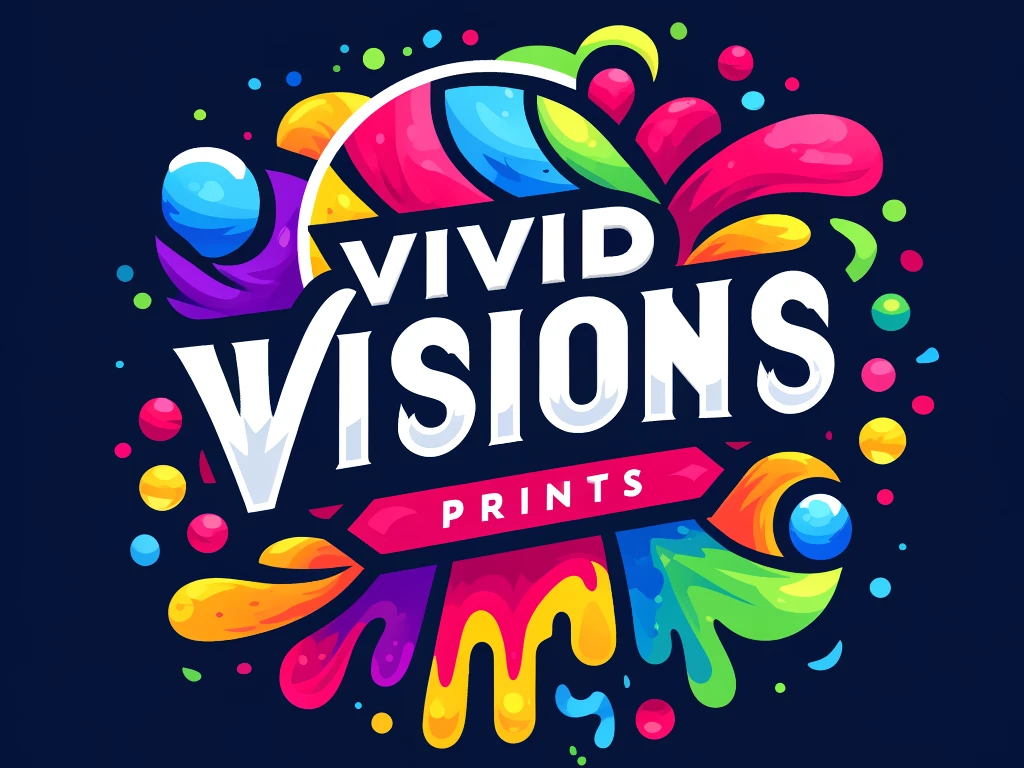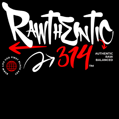

The design process began with identifying the primary message and experimenting with various typographic treatments. Type size, weight, and spacing were carefully adjusted to create a dynamic flow and balance. Red, black, and white were chosen to enhance contrast and draw attention to critical phrases. The resulting poster emphasizes how typography can blend function and form into a cohesive visual statement.
Tools Used: Adobe InDesign, Adobe Illustrator
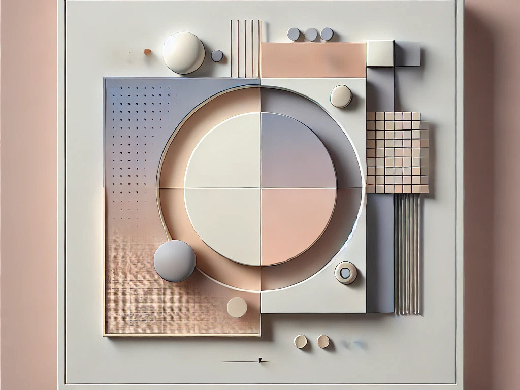
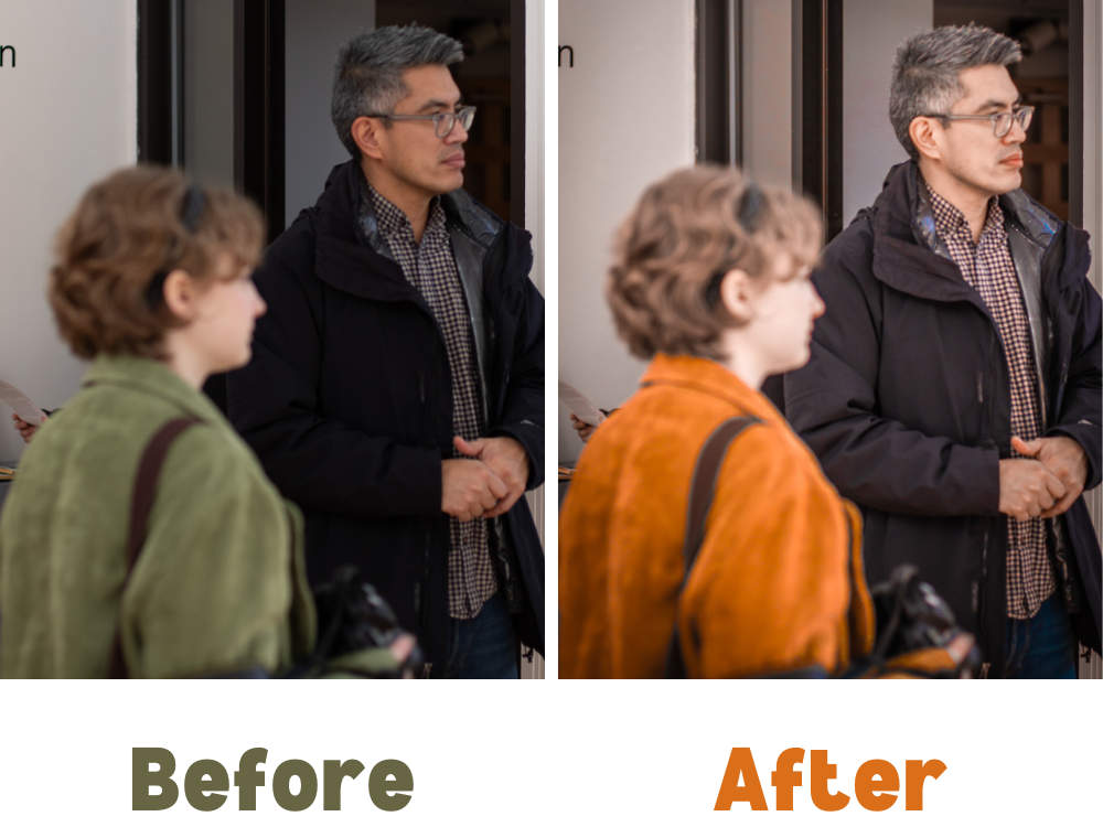
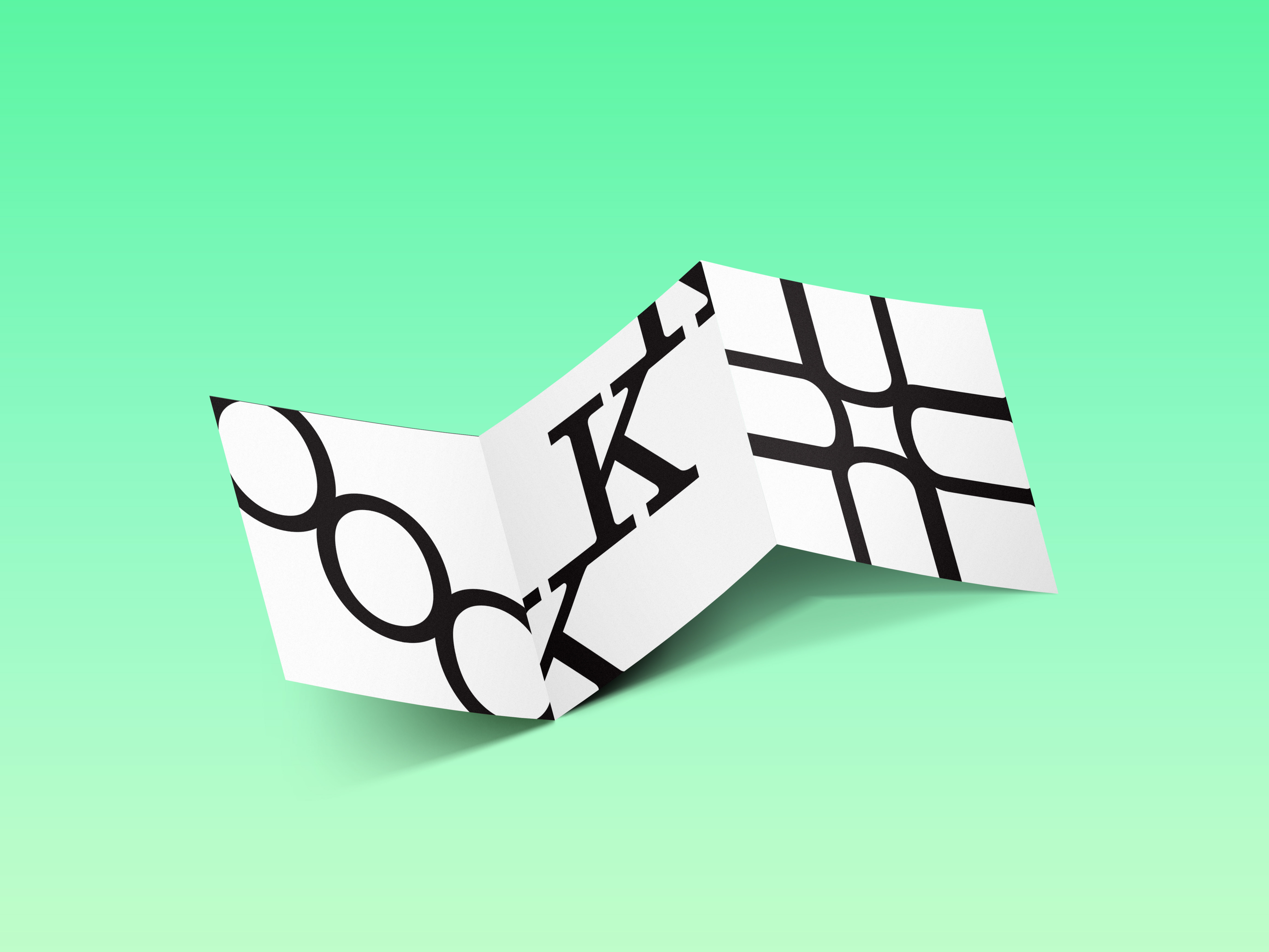
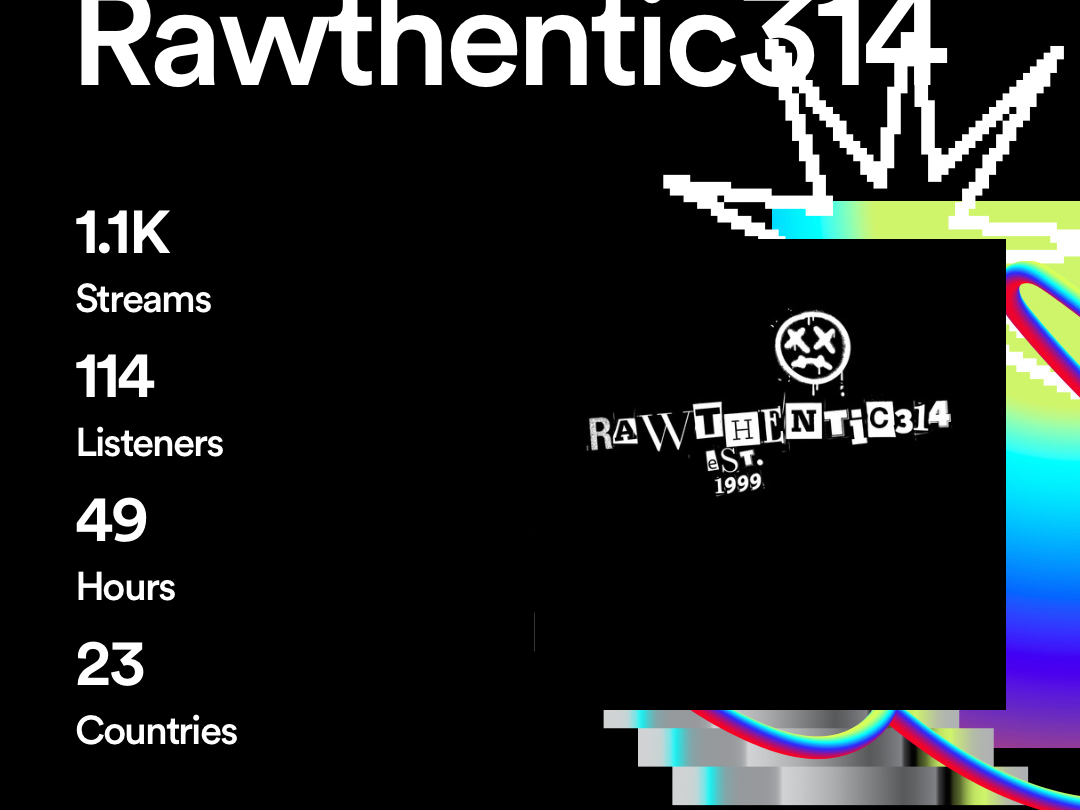
Skills Highlighted: Visual Hierarchy, Typography, Color Theory, Layout Design, Exhibition-Worthy Design
Skills Highlighted: Visual Hierarchy, Typography, Color Theory, Layout Design, Exhibition-Worthy Design